Fine Line and Blackwork offer different ways to organize a tattoo design. Fine Line emphasizes delicate contours and open space. Blackwork uses stronger black shapes and contrasting negative space. Neither label settles the quality or suitability of an individual design. Compare the same subject at a similar size, then discuss the actual drawing and intended placement with an artist who works in the direction you prefer.
Scroll horizontally to see all columns.
| Design feature | Fine Line example | Blackwork example |
|---|---|---|
| Main structure | Thin contours | Solid black shapes |
| Open areas | Airy space between lines | White channels between dark regions |
| Review closely | Crowded internal contours | Merged filled shapes |
| What the image cannot establish | Healed appearance or practical suitability | Healed appearance or practical suitability |
- Keep the subject constant. Open the studio and use AI Tattoo Generator to compare one motif in both styles, keeping the subject and composition consistent.
- Compare the visual structure. Look at contours, filled areas and the gaps that keep details separate.
- Review the intended use. Check the whole design and a smaller preview, then ask an artist about the practical drawing.
Fine Line vs Blackwork tattoo designs at a glance
A useful comparison begins with what is visible in the artwork. In the Fine Line peony example, thin contours describe the petals and leaves, leaving much of the image open. The design depends on the relationship between those lines and the surrounding white space. Adding many tiny contours can change that impression even when the strokes remain thin.
In the Blackwork example, dark shapes carry more of the visual weight. The spaces between them are part of the design, not simply an unused background. A black area needs a deliberate outline and enough separation from its neighbors for the motif to stay understandable. Blackwork can be complex or restrained; its label does not require filling every available region.
The examples here were generated locally from prompts for the same subject: one peony flower with two leaves. They are separate generated illustrations, so individual petal arrangements differ. Treat them as a comparison of visual direction, not as a claim that the generator can restyle a drawing while preserving every original contour exactly.
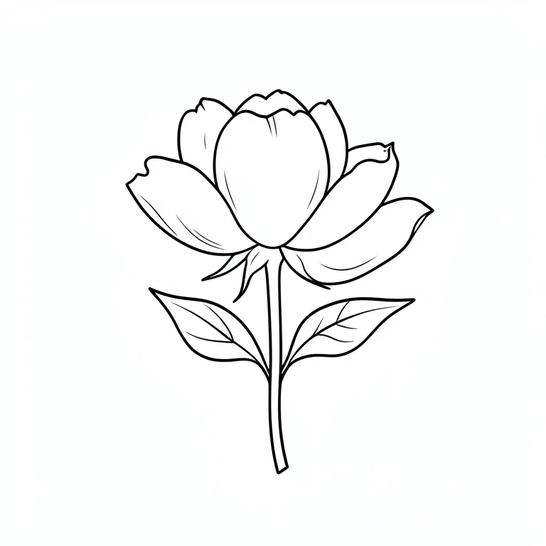
Fine Line example: a peony described primarily by thin contours. Generated artwork is a reference for discussion.
Look at line weight and negative space
For the finer example, inspect where lines approach each other. Petal edges, leaf veins and overlapping stems can make a drawing feel busy if too many marks compete in a small area. The question is not simply whether the strokes are thin; it is whether each mark adds information that remains readable in the overall composition.
For the darker example, inspect the edges of filled shapes and the white channels between them. If two dark regions merge visually, an important boundary may disappear. If every petal has the same dark weight, the eye may struggle to find a focal point. Compare the center of the flower with the outer leaves to see where the emphasis actually sits.
Reduce both images to a similar on-screen width and compare their silhouettes. Then open them larger to inspect detail. This does not simulate healed skin or establish a minimum safe tattoo size. It helps you identify a clear preference and specific questions for your artist, such as whether an internal contour should be removed or a gap should be widened.
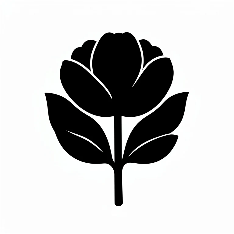
Blackwork example: intentional solid areas balanced with open channels. Compare the actual shapes, not only the style name.
Make a fair comparison of the same motif
Keep the subject, broad composition and viewing size as similar as possible. A large dragon and a tiny flower are not a useful test of style alone. Describe the same peony in each prompt, then change the treatment: delicate contours for one, deliberate black fills for the other. Keep both original downloads so you can examine them side by side.
Judge the result against the prompt rather than assuming the style selector guarantees a particular outcome. A supposedly fine-line drawing can contain heavy borders. A blackwork request can produce gray shading or cramped details. If the treatment misses your intention, revise one point explicitly and compare the new image with the earlier result.
You can also upload your own drawing and compare placement without generating a new motif. When choosing between alternatives, save the mockups with descriptive filenames and keep the same body photo. This removes one source of visual variation and makes it easier to explain whether your preference comes from the artwork itself or from the way it sits on the body.
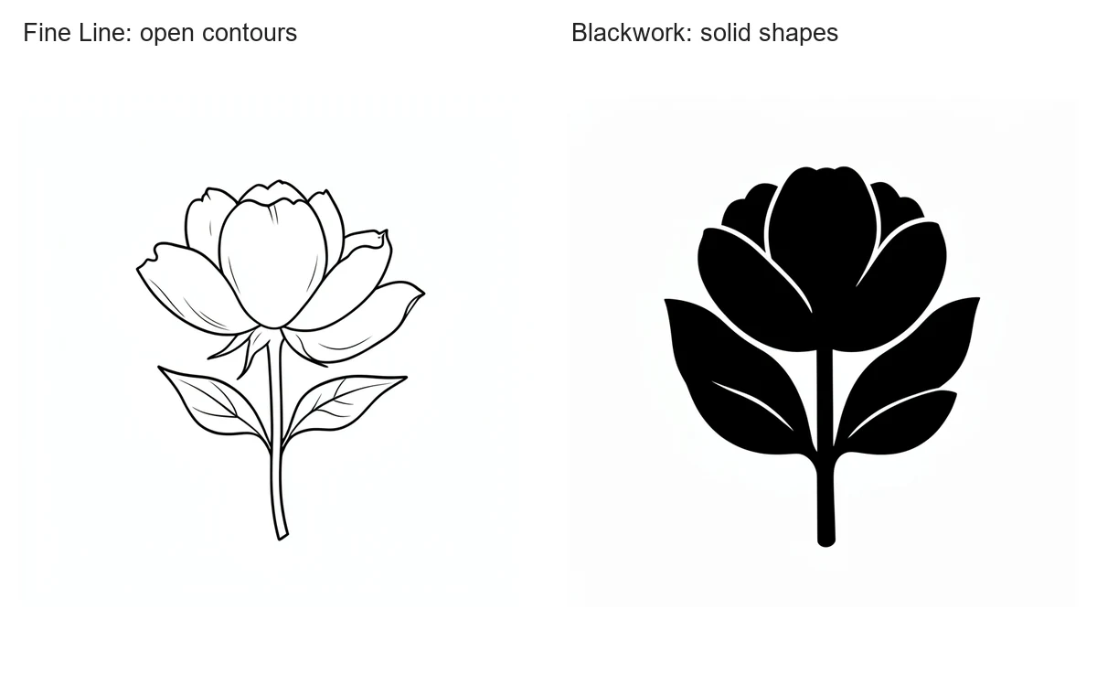
The same subject makes the treatment easier to compare. These are separate generated concepts, not photographs of finished tattoos.
Turn a style preference into an artist brief
Bring the two examples and explain what you like about each. You might prefer the open petals of the lighter drawing and the strong leaf silhouette of the darker one. That is more useful than asking for a style label without showing the visual qualities you mean. An artist can discuss whether combining those qualities suits the intended composition.
Ask to see relevant examples of the artist's own work and discuss the proposed size and detail. This guide does not rank styles by pain, healing or longevity; those questions need context that a generated image cannot provide. Keep the conversation focused on the actual drawing, your preferences and the professional decisions required to make the design work.
Common questions
Is Blackwork the same as a grayscale shaded image?
Not necessarily. The examples here use intentional solid black shapes and negative space. A gray shaded illustration can have a different visual structure even when it contains no color.
Can I combine finer lines and filled shapes?
Yes, a drawing can use both. Describe the balance you want and discuss the actual composition with your artist rather than forcing every element into one label.
Continue with your design
Use the illustrated Tattoo Drawings walkthrough for the complete product workflow, or open the studio with your own idea. Browse all tattoo design guides for related tasks.